top of page

Updated: Oct 8, 2018


Low poly illustration of Stumpy the Pigeon

Last summer QUT Science Engineering Faculty asked us to work on a communications package. The brief required postcard designs, a range of letterheads, web banners and template concepts for Microsoft PowerPoint presentations and an online newsletter. I'm not going to show you the final artwork, instead this post is intended as a design memorial for a low-poly

pigeon with bionic feet.


The first stage of the project featured Stumpy the Pigeon (sometimes known as Stumpy the White Pigeon), a well known QUT resident with missing feet (... and to be perfectly honest, a bit of a potty mouth if you follow him on social media facebook.com/pmstumpyyourtits.


Sadly, Stumpy lost his star role in the finished artwork but we really want you to see him here before he is consigned to our archives forever. Amen. And we thought that the QUT SEF student fanclub would like to see Stumpy reborn in

all his bionic glory.


The low poly illustration technique allowed us to gift Stumpy with new feet. Low Poly rendering contours the surface area of an illustration in triangular sections. This is the bottom section of our low poly illustration of Stumpy the Pigeon.


Low poly illustration of Stumpy the Pigeon. Design concepts for Queensland University of Technology, Science and Engineering Faculty

In these Stumpy the Pigeon draft postcard layouts you can see we took our star into space.


Stumpy the Pigeon QUT Postcard

Stumpy the Pigeon QUT Postcard

During the design process QUT branding guidelines and web page layout information was considered and incorporated. The 3 web banners below needed to work on 2 widths of screen (or with 2 break points).

Stumpy the Pigeon QUT web banners

We loved removing Stumpy from his built environment at QUT Gardens Point and perching him on monolithic type constructions set in space, instead of vending machines but like Stumpy, the idea just didn't have feet. In the final artworks Stumpy was replaced by request with a door but we kept our monoliths and the space theme.

Updated: Jun 15, 2018


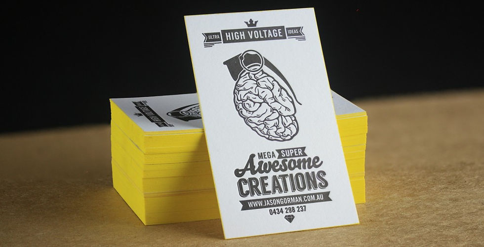
Edge Painted Business Cards

As all designers know, creating your own brand identity is a one of the most time consuming, anxiety ridden and decision adverse tasks that you can possibly undertake. Does it communicate the right message? Will my market embrace it? Will it attract new customers? Will it have longevity? Is it really me? (insert sleepless nights here) But we also know that at some point we have to put rubber to the road and commit.


I had been itching to collaborate with illustrator and designer Jason Gorman for ages! I just love his passion and infectious enthusiasm for life. When I caught up with him over a couple of glasses of vino, he mentioned that he had been working on his own brand identity. The timing was fortuitous because I had a few spare sheets Spicers Stephen Chilled White lying around the workshop. So I asked Jason if I could bring his brand to life as a letterpress business card.


When I run my fingers over Jason’s awesome Thought Grenade Logo, I feel that I am touching someone’s brain!

There is something about letterpress print that is galvanising. Suddenly an idea on a computer screen develops a permanence and a life of its own. And the characteristic that sets letterpress apart from other print processes, is its dimensional nature. It delivers such a tactile experience. You cannot stop your fingers from touching the impressed type. And this is certainly the case with Jason’s design.


When I run my fingers over Jason’s awesome Thought Grenade Logo, I feel that I am touching someone’s brain! And I am pleased to report that brains are not squishy and grose but are in fact pleasantly velvety to the touch (largely thanks to the paper selection – thanks again Spicers). And what better way to set off the Thought Grenade than to add an explosive comic book yellow edge paint that screams kerr-booooom!


Consider an edge paint for your next order. Looks so damn hot!


bottom of page