top of page

Updated: Oct 26, 2018


Fluoro edge painting business cards

At The Love Press, we love getting out the craft glue and safety scissors and experimenting with new embellishing techniques and improving upon existing ones. It had been bugging us for a while that whenever we did a fluoro edge painting job, the colours just looked a little lack lustre. We certainly weren’t achieving that 80’s fluorescent vibe that we were after.


So we rolled up the lab coat sleeves, bought every available fluorescent paint on the market and got to work. After a week of testing we had determined which one yielded the desired result ie the fluoro colour most likely to cause us to break into Wham’s Wake Me Up Before We Go-Go and dance around the studio whilst man-clapping.


With a bit more testing we refined the fluoro edge painting application method even further (top secret of course) and tested it to ensure we could consistently achieve the result. So once we were happy that we had nailed it, we just needed a real job to test in out on.


Fluoro edge painted letterpress business cards

That day, an order came through for some letterpress business cards for Led By Design, a crack team of visual artists. The card was a nice clean design printed black letterpress both sides. Quite a nice job on its own, but knowing that the Led By Design crew understand the importance of communication pieces with impact, I thought they might be a good candidate for some fancy fluoro edge painting. Luckily they agreed!


Updated: Jun 15, 2018


Edge Painted Business Cards

As all designers know, creating your own brand identity is a one of the most time consuming, anxiety ridden and decision adverse tasks that you can possibly undertake. Does it communicate the right message? Will my market embrace it? Will it attract new customers? Will it have longevity? Is it really me? (insert sleepless nights here) But we also know that at some point we have to put rubber to the road and commit.


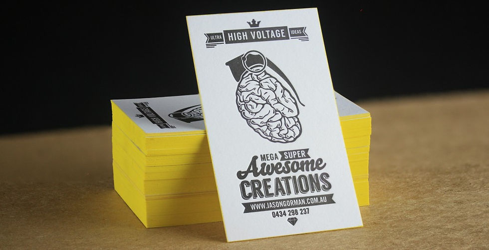
I had been itching to collaborate with illustrator and designer Jason Gorman for ages! I just love his passion and infectious enthusiasm for life. When I caught up with him over a couple of glasses of vino, he mentioned that he had been working on his own brand identity. The timing was fortuitous because I had a few spare sheets Spicers Stephen Chilled White lying around the workshop. So I asked Jason if I could bring his brand to life as a letterpress business card.


When I run my fingers over Jason’s awesome Thought Grenade Logo, I feel that I am touching someone’s brain!

There is something about letterpress print that is galvanising. Suddenly an idea on a computer screen develops a permanence and a life of its own. And the characteristic that sets letterpress apart from other print processes, is its dimensional nature. It delivers such a tactile experience. You cannot stop your fingers from touching the impressed type. And this is certainly the case with Jason’s design.


When I run my fingers over Jason’s awesome Thought Grenade Logo, I feel that I am touching someone’s brain! And I am pleased to report that brains are not squishy and grose but are in fact pleasantly velvety to the touch (largely thanks to the paper selection – thanks again Spicers). And what better way to set off the Thought Grenade than to add an explosive comic book yellow edge paint that screams kerr-booooom!


Consider an edge paint for your next order. Looks so damn hot!


bottom of page